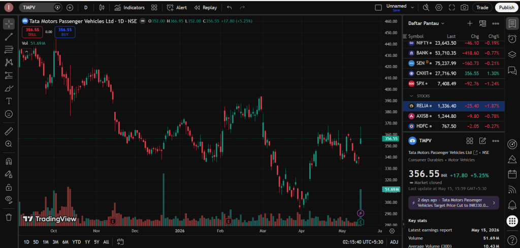
1. Introduction to Tata Motors Passenger Vehicles (TMPV) and Daily Grid Setup
In the Indian stock market, the automotive sector has been a center of massive interest. While commercial trucks move the logistics sector, passenger cars represent the growing aspirations of Indian families. This specific chart tracks Tata Motors Passenger Vehicles Ltd. under the ticker TMPV. This is the specialized consumer arm of Tata Motors that manufactures highly popular cars, SUVs, and leading electric vehicles (EVs) like the Nexon EV and Punch EV.
For an entry-level analyst or a retail trader looking at charts from a small town or village in India, a trading terminal can look like a maze. However, technical analysis is just an plain language written in colors and shapes. It maps out where large financial groups are putting their cash and where they are pulling it out. Learning this layout ensures you protect your capital and build clean, independent market views.
Understanding the Daily (1D) Chart Format:
Look at the top header bar of the chart image. The symbol “1D” is highlighted. This means we are analyzing a Daily Chart.
- Every single green or red candle stick represents exactly one full day of trading action.
- Daily charts are highly useful because they remove the temporary day-to-day panic and show the real, macro-level intent of institutional capital over several consecutive months.
2. Current Price Snapshot and Historical Journey
Let let us analyze the live closing figures displayed on the right-hand dashboard of your screen. The stock price of TMPV finished its latest trading day at ₹356.55. During that last session, the stock experienced a major, aggressive positive move, jumping upward by ₹17.80, which is a single-day gain of +5.25%.
While this recent +5.25% green candle looks highly energetic, we must look backward across the entire chart grid from left to right to understand the larger context of where this stock has traveled.
The Technical Timeline:
- October to November (The Premium Top): At the start of the chart, the stock was trading very high, up in the ₹430 – ₹450 zone. This was a phase where market optimism was at an all-time high.
- December to March (The Consistent Downward Staircase): After hitting those premium highs, the stock entered a long, exhausting downward cycle. It kept sliding month after month, dropping through the ₹400 and ₹360 boundaries.
- The April Climax (The Deep Crash Base): The selling pressure accelerated aggressively in late March and early April, forcing the stock down into a deep discount floor near ₹290 – ₹300.
- The May Liftoff (Current Status): After hitting that deep bottom, the stock suddenly found a surge of energy. It has launched a rapid recovery wave, pushing it back up to its current level of ₹356.55.
3. Explaining Market Structures: Lower Lows vs. Sudden Breakouts
To read a chart effectively, you must understand the changing structure of price waves. This chart shows a transition from a bear cycle to a sudden dynamic breakout.
[The Long Downward Slide]               [The Sharp V-Bottom Turn]
    Peak (₹440 - ₹450)                         Current Price (₹356.55)
       ╲                                               ▲
         ╲   Lower Peak                               ╱
           ╲    ╲                                    ╱  [Fast Buying Surge]
             ╲    ╲                                 ╱
               ╲   Lower Low                       ╱
                 ╲                                ╱
              Bottom Floor (₹290) ────────────────
The Downtrend Wave (Left to Center):
For the first half of the chart, the price action shows a standard Downtrend. Every time the stock tried to bounce up, it stopped at a lower peak than the bounce before it (Lower Highs). When it fell, it broke below old floors to establish Lower Lows. This tells an analyst that sellers were highly aggressive, dumping shares at cheaper and cheaper rates to get out of their positions.
The Trend Invalidation (Far Right):
Look closely at the very end of the chart grid covering May. The structural pattern of lower highs has suddenly been shattered. The stock formed a very sharp V-shaped bottom around the ₹290 level and shot up vertically. A sudden 5.25% move means the passive distribution phase has ended abruptly, and aggressive buying pressure has returned to the counter.
4. Mapping Out the Support Floors and Resistance Ceilings
Stocks move between horizontal levels where buyers and sellers congregate. Let us establish the critical areas on this TMPV grid.
A. The Macro Support Base (₹290 – ₹300 Zone):
This is the absolute bottom of the entire chart. When the stock dropped to the ₹290 level in April, it became extremely cheap. Big institutional funds, domestic banks, and value investors looked at the growing car sales of Tata Motors and decided that ₹290 was an incredible bargain price. Their massive limit orders sat at this level like a solid concrete floor, completely halting the decline and initiating the current liftoff.
B. The Next Dynamic Resistance Ceiling (₹370 – ₹380 Zone):
As the price marches upward, it is approaching an old congestion zone near ₹370. If you look back at the center of the chart (around February and March), the stock paused and bounced multiple times near ₹370 before finally breaking down. In chart theory, an old broken support floor very often transitions into a tough resistance ceiling when the price tries to climb back up to it. Sellers who bought higher up might use a rally to ₹370 to exit evenly, creating temporary supply.
5. Reading the Volume Indicator: Tracking Institutional Footsteps
The vertical bars at the bottom of your TradingView screen represent the Volume. Volume is the absolute truth indicator in trading—it tells you exactly how many shares were traded on that day.
The Massive Volume Climax Explored:
- Look at the bottom center of the chart around late March. You will see a monstrously tall, isolated green volume bar that shoots up far above all other bars on the screen.
- This is called a Volume Climax. When a stock is crashing and a gigantic volume spike occurs, it means retail traders are panicking and selling everything out of fear, while a massive institutional buyer is sitting on the other side, absorbing millions of shares in a single day.
- Now look at the far right edge under the current +5.25% day. The volume bar is recorded at 51.69 Million shares (51.69M), which is vastly higher than the 30-day average volume of 10.43 Million shares (10.43M). A massive price jump backed by 5x normal volume confirms that institutional big money is aggressively loading up on shares, making the move highly valid.
6. Forward-Looking Technical Scenarios: The Two Paths Ahead
An expert analyst never guarantees a certain target. Instead, you prepare a logical plan for both potential market behaviors.
Scenario A: The Continuation and Reclaim Path
If the huge institutional buying momentum seen in the 51.69M volume bar continues to absorb the market supply over the coming sessions:
- The Action: The price will comfortably break above the immediate resistance level of ₹365 – ₹370.
- The Target: A clean daily candle closing above ₹370 would confirm a macro structural reversal, allowing the stock to systematically target the higher historical gaps and peaks near the ₹400 milestone.
Scenario B: The Resistance Rejection and Cooling Path
Because the stock has rallied very fast from its ₹290 base without taking a break, short-term swing traders might look to lock in quick profits near the old resistance zone.
- The Action: The price might touch the ₹365 – ₹370 ceiling and face a minor cooling-off drop or horizontal consolidation.
- The Target: If the stock drops slightly but holds above the ₹330 mark on a daily closing basis, it forms a healthy “Higher Low.” This would allow the stock to rest and gather strength before making a secondary attempt to break the higher ceilings.
7. Summary and Career Alignment on Hashtoo.com
This comprehensive study of the Tata Motors Passenger Vehicles chart delivers an invaluable financial lesson: true market reversals are always validated by significant volume explosions. When price jumps on low volume, it is often a trap. But when a stock breaks out by over 5% with volume matching 51.69 Million shares against an average of 10 Million, it displays a clean, unmistakable signature of institutional accumulation.
By mastering this clean language of candlestick trends, major horizontal zones, and volume profiling, you build an ironclad skill set. You move out of the high-risk loop of losing capital on random social media tips and start reading the stock charts like a data professional.
Documenting these clear, educational case studies on Hashtoo.com allows aspiring analysts from small towns and rural areas across India to construct a clean, verified track record of their chart logic. This elevates your personal branding, highlights your content inside our premium Featured Analyst brackets, and helps you earn expanding rewards based on the pure structural quality of your research as you climb our professional career ladder.
Important Note (Disclaimer):
This analysis article is written strictly for educational, learning, and case-study purposes. We do not provide any stock tips, financial advisory services, or direct “Buy” or “Sell” signals on this platform. Stock market trading and investing involve a very high level of financial risk, and you can lose your capital. Always do your own research or talk to a certified, SEBI-registered financial advisor before investing your hard-earned money. The writer receives a fixed page-formatting and content-structure fee under the Hashtoo.com Creator program, which is completely independent of the direction of the stock price.
Post Approved For: Hashtoo Educational Hub (Automotive Sector & High-Volume Momentum Track) Verification Reference ID: HT-EQ-TMPV-2026-V1

 Stock Chart Analysis: Understanding Long-Term Drops, Quick Bounces, and Volume Signatures)