1. Introduction to HDFC Bank and the Hourly Chart View
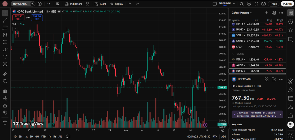
When we want to understand how a large company’s stock is performing, we use charts on software platforms like TradingView. The image provided above displays the stock price behavior of HDFC Bank Limited, which is one of the largest and most influential private sector banks in India.
For a non-English-speaking trader or someone coming from a small village or town in India, looking at a stock chart can feel like looking at a complex map. However, if we break it down into simple pieces, it becomes very easy to read.
What is an Hourly (1h) Chart?
In this specific chart, look at the top left corner where it says “1h”. This means we are analyzing an Hourly Chart.
- Unlike a daily chart where each candle represents a full day of trading, on this chart, every single red or green vertical candle represents exactly 1 hour of trading activity in the stock market.
- Hourly charts are incredibly useful for traders because they show us the immediate sentiment of the market. It reveals what buyers and sellers are doing throughout individual trading sessions, allowing us to see patterns develop much faster than they would on a weekly or monthly scale.
2. Current Price Status and Market Context
Let us look at the current numbers displayed on the right side of the screen. The stock price of HDFC Bank is currently at ₹767.50. Over the last recorded session, the stock price fell by ₹2.05, which is a minor drop of 0.27%.
When we look across the entire screen from left to right, we can see that the price has not been moving in a straight line. Instead, it moves like waves in an ocean—sometimes climbing high, and sometimes sliding low. This wavy structure is the fundamental nature of the stock market.
The Big Picture Look:
If you look at the left side of the chart (representing the earlier trading hours in mid-April), the stock was trading higher, close to the ₹815 – ₹820 range. However, as time moved forward toward May, the price steadily pushed lower, forming a macro downward trend.
Right now, the stock is trading near the bottom right quadrant of our screen, which means it has entered a short-term corrective or discount phase. For a regular town or village trader, this means the stock has become significantly cheaper than it was a few weeks ago, but we must look deeper into the structural patterns to see if the falling movement is slowing down or getting stronger.
3. Reading Candlesticks: Red vs. Green in Simple Terms
The entire chart is made up of rectangular boxes with small lines sticking out of the top and bottom. These are called Japanese Candlesticks, and they are the language of chart reading.
  [Green Candle]                [Red Candle]
       High                          High
        ┃                             ┃
     ┏━━┻━━┓                       ┏━━┻━━┓
     ┃Close┃                       ┃Open ┃
     ┃     ┃                       ┃     ┃
     ┃Open ┃                       ┃Close┃
     ┗━━┳━━┛                       ┗━━┳━━┛
        ┃                             ┃
       Low                           Low
 (Buyers drove price UP)       (Sellers pushed price DOWN)
- The Green Candles: A green candle forms when the price of HDFC Bank closes higher at the end of that hour than it did when the hour started. This is a visual sign that Buyers (Bulls) were strong during those 60 minutes and aggressively pushed the market upward.
- The Red Candles: A red candle forms when the price closes lower at the end of the hour than when it began. This is a visual sign that Sellers (Bears) dominated that time block and threw supply into the market, driving the price downward.
- The Shadows or Wicks (The Small Lines): The thin vertical lines sticking out above and below the candle bodies are called wicks or shadows. The highest point of the top line shows the maximum price reached during that hour, while the lowest point of the bottom line shows the lowest price reached. Long bottom lines mean buyers stepped in to push the price up from its lowest point before the hour ended.
4. Detailed Analysis of the Price Patterns (Waves)
To become a good chart reader, you must stop looking at single candles and start looking at the overall shape the waves are making. On this HDFC Bank chart, we can identify three distinct phases of price movement:
A. The Resistance Peak (Top Ceiling):
At multiple points on the left half of the chart, the price climbed up to around ₹815 – ₹820, but every single time it reached that area, it stopped moving up and fell back down. In simple language, this area acts like a Ceiling or Resistance Zone.
Think of it like throwing a rubber ball inside a room; when it hits the ceiling, it bounces back down. In the stock market, a ceiling forms because large institutional investors or traders decide that the stock has become expensive enough, and they start selling heavy quantities of shares there.
B. The Downward Slide (Lower Highs and Lower Lows):
After failing to break above the ₹820 ceiling, the market began a systematic downward slide. If you track the peaks of each small upward bounce on this chart, you will notice something very interesting: each bounce stops at a lower point than the previous bounce. * In technical trading, this structure is called a series of Lower Highs.
- Simultaneously, the bottoms of the drops keep breaking lower, forming Lower Lows.
When a stock forms lower highs and lower lows, it tells us that the sellers are highly aggressive. They are not even waiting for the stock to fully recover before dumping more shares; they are selling at lower and lower prices. This is a textbook definition of an established Downtrend.
C. The Consolidation and Current Support Base:
Now look closely at the right-hand side of the chart, covering the latest trading sessions up to May 15 and May 18. The aggressive, vertical falling movement has stopped. Instead, the price candles are moving sideways in a tight, horizontal band between ₹755 and ₹775.
This sideways movement is called Consolidation. It means the market has hit a Floor or Support Zone. A floor forms when the price drops to a level where retail traders, long-term investors, and algorithmic trading systems believe the stock has become highly discounted and attractive. Buyers start matching the selling volume, which stops the price from falling straight down.
5. Volume Analysis: Understanding the Bottom Bars
If you look below the price chart, there is a separate section filled with vertical bars colored in red and green. This is the Volume Indicator, and it is one of the most powerful tools for any trader. Volume tells us the total number of shares that changed hands between buyers and sellers during that specific hour.
[High Volume Bars] ──► Big Institutions are Active (Real Trend Strength)
[Low Volume Bars]  ──► Small Retailers or Quiet Market (Weak Trend Strength)
Why Volume Matters:
Price action alone can sometimes trick you, but volume never lies. If a stock price rises but the volume bars are very short, it means very few people are participating, and the upward movement is weak. On the other hand, if a price movement happens with very tall volume bars, it means big institutional funds (like Mutual Funds, Foreign Institutional Investors, or Banks) are actively participating.
What HDFC’s Volume Tells Us Right Now:
- If you look at the middle of the chart where the price was crashing heavily, you can see several very tall red volume bars. This shows that the fall was backed by huge selling pressure—large accounts were actively exiting the stock.
- However, look at the volume bars over the last few trading sessions on the far right. The bars have become much shorter and are staying at a consistent average height. This contraction in volume during a sideways price consolidation is a vital clue. It means that the heavy panic selling has largely exhausted itself, and the market is quietly resting on its support floor, waiting for a fresh trigger.
6. Future Market Scenarios: The Two Paths Ahead
A disciplined and professional analyst never guesses or claims to know exactly where the market will go tomorrow. Instead, a smart analyst prepares for both possibilities based on key structural levels. For this HDFC Bank chart, we have two primary paths to watch:
Scenario 1: The Bullish Reversal (The Floor Holds)
If the current support floor between ₹755 and ₹760 continues to hold firmly, it proves that buyers are stronger than the remaining sellers at this price.
- The Trigger: If the price starts moving up from here and breaks above the immediate minor ceiling of ₹780 with a strong, solid green candle accompanied by a tall volume bar, it will signal a trend reversal.
- The Outcome: This would mean the short-term downtrend is officially over, and the stock could begin a new upward journey back toward the next major targets near the old resistance zones of ₹795 and ₹815.
Scenario 2: The Bearish Breakdown (The Floor Breaks)
If global market conditions turn negative, or if bad news hits the banking sector, the current buying support at ₹755 might not be enough to hold the weight of sellers.
- The Trigger: If the price drops below the absolute low of this consolidation zone (around ₹750) and a full 1-hour candle body closes below that line, it means the support floor has cracked open.
- The Outcome: This breakdown will trigger automated stop-loss orders of swing traders who bought at the floor, forcing a fresh wave of technical selling. The price would then slide down further to look for a much deeper, historical support level on the daily or weekly charts.
7. Summary and Career Guidance for Aspiring Analysts
By studying this HDFC Bank chart, we learn that prices move in logical frameworks controlled by supply, demand, and volume support floors. It is not random gambling. Successful trading is about waiting patiently for the price to reach these critical inflection floors or ceilings and observing how volume behaves before making any plans.
Instead of losing capital by blindly following random, unverified stock tips on social media apps, retail enthusiasts from small towns and villages can master this exact skill of reading candlesticks, trends, and volume bars.
By building a disciplined, data-backed approach to chart analysis, you can publish your educational case studies directly here on Hashtoo.com. This allows you to construct a verified, professional research portfolio that tracks your analytical accuracy, upgrades your status to a Featured Analyst, and builds a legitimate career ladder in the Indian financial markets.
Important Note (Disclaimer):
This analysis article is written strictly for educational, learning, and case-study purposes. We do not provide any stock tips, financial advisory services, or direct “Buy” or “Sell” signals on this platform. Stock market trading and investing involve a very high level of financial risk, and you can lose your capital. Always do your own research or talk to a certified, SEBI-registered financial advisor before investing your hard-earned money. The writer receives a fixed page-formatting and content-structure fee under the Hashtoo.com Creator program, which is completely independent of the direction of the stock price.
Post Approved For: Hashtoo Educational Hub (Indian Equity Markets Track) Document Verification Reference: HT-EQ-HDFC-2026-V1
